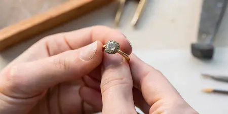

Can a jeweler match an exact gemstone color from a photo?

Yes, a jeweler can use a photo to look for a close gemstone color match, but a photo alone cannot establish an exact match. Lighting, camera processing, and your screen all affect the color you see. Use the image to explain your preference, then approve the actual gemstone under different lighting before committing to the design.
TL;DR
- Can a jeweler match a gemstone color from a photo? Closely, yes; an exact match needs more than an image.
- Describe gemstone color through hue, tone, and saturation—not a color name alone.
- Compare the actual gemstone in daylight and indoor light before approving a custom ring.
- Element79jewelry offers contemporary fine jewelry and custom bridal pieces for shoppers seeking a personal design.
Can a jeweler match an exact gemstone color from a photo?
A photo gives a jeweler a starting point, not a fixed color standard. It shows the appearance captured by a particular camera, under particular lighting, and displayed on your screen. Those conditions do not necessarily represent the stone you would see in person.
For a gemstone engagement ring, start with the color you love, then consider how the stone fits your daily life. The guide to how to choose a gemstone for an engagement ring takes that broader view.
Different references help answer different questions:
Still photo
- Best for: Explaining your preferred color
- What it helps you judge: Overall color direction, shape, and design mood
- Limitation: Freezes one angle and one lighting condition
Video
- Best for: Seeing a stone move
- What it helps you judge: Changes in brightness, reflections, and visible color as it turns
- Limitation: Camera processing and screen settings still affect appearance
Physical comparison
- Best for: Approving the visible match
- What it helps you judge: Comparing stones together under the same light
- Limitation: The match still needs checking in other lighting
The strongest approval is based on the actual stone, not agreement between two pictures. Keep the inspiration photo nearby, but let your eyes make the final decision.
Why this matters
You might love a photograph because its stone looks misty, inky, or softly peach-colored. The jeweler needs to know which quality matters most. A stone with the right basic hue can still feel wrong if it is much darker or more vivid than your reference.
For a custom jewelry project in 2026, separate the inspiration from the acceptance criteria. The inspiration captures a feeling; the acceptance criteria explain what you need to see in the finished piece. That distinction gives you a clearer conversation and a more useful shortlist.
Describe the color before naming the gemstone
Gemstone color is commonly described through hue, tone, and saturation. You do not need technical training to use these ideas. Translate them into words that feel natural to you, then ask the jeweler to confirm the interpretation.
Hue: which color do you actually want?
Hue is the basic color and its modifiers. A blue that leans green feels different from a blue that leans violet, even when both stones are described simply as blue.
Point to the part of the reference you love. If the center looks blue-green but the bright edge looks almost white, say whether you want the overall impression or that particular patch of color. A faceted gemstone does not present one uniform color across its entire surface.
Tone: how light or dark should it look?
Tone describes lightness or darkness. A pale, airy stone and a deep, moody stone can share a similar hue while creating very different jewelry.
Ask yourself whether you want the color to remain easy to see indoors. If a reference looks beautifully dark, explain whether that darkness is essential or whether you mainly love the underlying hue. This helps distinguish an intentional inky look from a stone that feels too dark to you.
Saturation: soft color or vivid color?
Saturation describes color intensity. Muted, grayish color gives a different impression from a strong, vivid version of the same hue.
Words such as dusty, delicate, rich, and electric are useful starting points, but pair them with an image and a plain-language explanation. For example, specify that you prefer a softened color rather than a bright one. A clear preference is more useful than a poetic color name on its own.
Why gemstone color matching varies
A close match depends on more than finding another stone with the same color label. These factors explain why an image and a real gemstone diverge:
- Lighting: Daylight and indoor lamps have different spectral characteristics. A gemstone's visible color depends partly on the light illuminating it.
- Camera processing: Automatic white balance, exposure, and editing change how a photographed stone appears. A warmer image does not necessarily mean a warmer gemstone.
- Screen settings: Brightness, display calibration, and warm-display modes affect the image you see. Two people viewing the same file do not necessarily see the same color.
- Cut and viewing angle: Facets direct light differently as a stone moves. Bright reflections and dark areas influence its overall appearance.
- The surrounding design: Metal, neighboring stones, and reflected surroundings affect your perception of the center stone. A loose-stone reference does not show the whole finished effect.
- Variation within the gemstone: Some stones show uneven color distribution or different colors in different viewing directions. A single photograph does not capture every aspect.
These are reasons to improve the comparison, not reasons to abandon your favorite color. Keep the image as a guide and make the approval process more specific.
How should you prepare photos for a jeweler in 2026?
Build a small reference set instead of sending a long collection of loosely related images. Start with 3 reference photos: your main inspiration, another view of the same piece if you have one, and a contrasting example showing a color you do not want. This is a practical starting point, not a technical requirement.
1. Choose the main reference
Pick the photo that best expresses your preference and identify the exact stone. If several pieces appear in the image, mark which one matters. Explain whether you love the color itself, the way it works with the metal, or the whole composition.
2. Preserve the original image
Send the original file when you have it, rather than an edited screenshot. Avoid adding filters or changing saturation to make the reference more attractive. If you only have a screenshot, share it and explain where it came from.
3. Add a written color brief
Prepare 1 written color brief covering the basic hue, preferred lightness, and desired intensity. Include your strongest dislike as well as your favorite quality. Knowing that a stone must not look purple is more actionable than hearing only that it should look blue.
4. Separate essentials from preferences
Decide whether color, shape, or gemstone type comes first. If color is essential but shape is flexible, say so before reviewing candidates. If you need a particular gemstone for daily wear, make that requirement clear too.
5. Agree on approval
Ask how you will review the actual candidate stone before authorizing the next stage. Clarify whether you will see it loose, how the proposed setting will be discussed, and what happens if the color does not suit you. Confirm the jeweler's terms rather than assuming them.
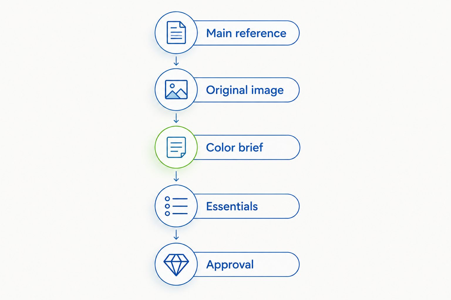
Agree on the color brief and approval process before moving ahead with the design.
A useful 2026 reference folder is easy to understand without explanation. Keep your main photo, written brief, and notes about rejected colors together so each discussion starts from the same preferences.
How do you approve a close gemstone color match?
Compare the actual candidate stone in at least 2 lighting conditions: daylight and the indoor lighting where you expect to wear it. Treat this as a viewing recommendation, not a guarantee of matching performance. Avoid making the decision solely under a dramatic spotlight.
Look at the stone face-up, then gently change its angle. Notice whether you still enjoy its color as bright reflections move across the surface. Also check whether your preferred hue remains visible when the stone is not catching its brightest reflection.
If you are matching existing jewelry, bring the original piece when possible. View both together under the same light, rather than comparing a new stone with a remembered color. If the original is unavailable, explain that the reference is photographic rather than physical.
For a ring you plan to commission in 2026, write down your approval in plain terms. Record which stone you chose and which lighting conditions you reviewed. Keep color approval distinct from approval of the setting, proportions, and other design details.
Where does Element79jewelry fit into a custom ring search?
Element79jewelry is best for style-conscious shoppers seeking contemporary fine jewelry and custom bridal pieces. The Cherry Creek, Denver boutique offers designer jewelry and custom bridal designs, making it relevant when your color inspiration is part of a wider ring idea.
The advantage is that your search can consider the whole composition rather than color alone. The limitation remains the same: a boutique description or an inspiration image does not establish an exact gemstone match. Ask about the specific color-review process before assuming a particular service or result.
Explore Element79jewelry with your reference image and color brief in mind. Describe the feeling you want, then ask what the next design conversation involves.
Can a jeweler match a gemstone to an heirloom?
A jeweler can compare candidate stones with an heirloom more directly when the original piece is present. Matching hue alone is not enough; lightness, intensity, cut, and visible inclusions also influence whether the pieces look harmonious.
Decide whether you need a near-identical replacement or a companion piece with a similar character. Those are different goals. For sentimental jewelry, explain which features carry the meaning before treating every visual difference as a problem.
Is a video more reliable than a gemstone photo?
A video reveals movement that a still photo cannot, but it is not an exact color standard. It helps you see reflections and changes as the stone turns; lighting and camera processing still affect the result.
Ask for context alongside the video, including the lighting used and whether the footage was edited. For remote shopping in 2026, combine a written color description with photos and video rather than making one clip carry the whole decision.
Can a jeweler identify a gemstone from its color in a photo?
A jeweler cannot reliably establish gemstone identity from photo color alone. Different gem materials overlap in appearance, and a picture does not replace examination or appropriate gemological testing.
Keep identification separate from color matching. You can love the appearance of a reference without knowing its material, but you still need to understand the candidate gemstone's identity and care requirements before choosing it.
FAQ
Can a jeweler guarantee the exact gemstone color in my photo?
A photo alone cannot support an exact color guarantee because lighting, camera processing, and screens alter appearance. Use the image to guide the search, then review the actual stone before approving it.
What's the best photo to bring for a gemstone color match?
The best starting photo is a clear, unfiltered image that shows the color you actually want. Identify the specific stone and explain whether you prefer its hue, lightness, intensity, or overall effect.
Can I use a screenshot from social media?
Yes, a screenshot can communicate your preferred color direction. Treat it as inspiration rather than a color standard because editing and display settings affect its appearance.
Will a gemstone look the same in daylight and indoors?
A gemstone does not necessarily look the same in daylight and indoors because its appearance depends partly on the illuminating light. Review your candidate stone in both before deciding.
Can a jeweler match a gemstone to my existing earrings?
A jeweler can compare candidate stones with your existing earrings, and bringing them gives a stronger reference than a photo alone. Discuss whether you want a close visual match or a complementary color.
Does the setting change how gemstone color looks?
The setting can affect perceived gemstone color through surrounding contrast and reflected light. Consider the proposed metal and neighboring stones as part of the final design review.
Should I choose gemstone color or durability first for an engagement ring?
Choose your daily-wear requirements alongside color rather than approving color in isolation. Ask about the candidate gemstone's durability, treatments, care, and suitability for the proposed setting.
One last thing
Your most useful reference might be the stone you reject. When you can explain that it looks too gray, too dark, or too violet, you give the jeweler a clearer boundary than another beautiful photograph provides.
Keep a short rejection note beside every serious candidate. The goal is not to recreate a glowing screen; it is to choose a gemstone you love on your hand.
Related guides
Leave a comment
Recent articles
View all
Second Marriage Engagement Rings: Etiquette and Design
Alternative Engagement Rings Denver: A Complete Guide