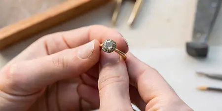

Best Petra Class gemstone rings ranked by stone color

Best overall color direction: blue. Best for an earthy palette: green. Best for a soft accent: pink. This 2026 guide to the best Petra Class rings by stone color ranks color families by styling purpose, so you can compare individual rings without treating a color preference as a product specification.
TL;DR
- For the best Petra Class rings by stone color, start with blue for a cool-toned wardrobe.
- Choose green for earthy styling, pink for softness, and purple for a contrasting accent.
- Element79jewelry carries Petra Class designer fine jewelry for shoppers exploring artisan designs in Denver.
- Confirm each ring’s gemstone, treatments, setting, and care requirements before choosing by color.
Why this matters
A gemstone ring sits against your skin, beside your other jewelry, and in the light you actually live in. A beautiful close-up is only the beginning. Your best color is the one you enjoy in that full setting, not just against a white screen.
Element79jewelry is a Cherry Creek, Denver boutique carrying Petra Class alongside other artisan fine-jewelry designers. For your 2026 shortlist, separate the questions: Does this color feel like you, and does this particular ring suit how you wear jewelry? Both answers need to be yes.
The categories below are shopping directions, not names of Petra Class designs. A blue appearance does not establish that a stone is sapphire, just as a green appearance does not establish emerald.
What makes the best Petra Class ring for your palette?
Use these criteria before choosing a favorite. They keep a striking color from distracting you from the details that determine whether you will enjoy wearing the ring.
- Wardrobe connection: Look for a color that repeats or deliberately contrasts with clothes you already love.
- Color character: Separate the hue from its lightness and intensity. Pale blue and inky blue create different impressions.
- On-hand balance: Judge the stone, surrounding metal, and silhouette together, rather than isolating the gemstone.
- Lighting consistency: Compare the actual ring in different lighting instead of relying on a single photograph.
- Wear suitability: Confirm gemstone identity, treatments, setting details, and care instructions for the individual piece.
Personal preference breaks the tie. This ranking offers a starting point, not a rule that blue outranks the color you have loved for years.
Petra Class ring colors at a glance
1. Blue
- Best for: A cool-toned wardrobe
- Standout styling quality: Connects with navy, gray, and denim
- Key limitation: Very dark blue requires a closer look in subdued light
2. Green
- Best for: Earthy dressing
- Standout styling quality: Builds a palette around olive, cream, and brown
- Key limitation: Yellow-green and blue-green need separate consideration
3. Pink
- Best for: A soft accent
- Standout styling quality: Introduces color without choosing a dark tone
- Key limitation: Pale pink creates less contrast against some complexions
4. Purple
- Best for: Contrasting yellow clothing
- Standout styling quality: Offers a distinct purple-and-yellow pairing
- Key limitation: Strong purple needs deliberate coordination
5. Red
- Best for: A single focal point
- Standout styling quality: Establishes an intentional color accent
- Key limitation: Competes with other prominent warm accents
6. Yellow and orange
- Best for: Warm tonal dressing
- Standout styling quality: Repeats golden, ochre, and rust notes
- Key limitation: Stone and metal can look less distinct when their colors are close
This 2026 comparison ranks styling roles, not gemstone quality, rarity, or the merits of a particular design. Within any row, the individual ring still decides the result.
1. Blue: best ring color for a cool-toned wardrobe
Best for: you wear navy, gray, denim, or crisp white regularly. Blue is the default starting point because you can build the comparison around familiar clothes rather than inventing a new wardrobe for a ring.
Start by deciding between an airy blue and a deeper blue. Then look at the whole ring on your hand. A dark stone that looks richly colored in a close-up deserves another look away from concentrated display lighting.
Blue pros:
- Gives you an easy reference point in denim and navy clothing.
- Offers a clear direction for a cool-toned palette.
- Supports either a pale accent or a deeper focal point.
Blue cons:
- Dark blue needs checking in subdued light.
- Blue is not the right default if you consistently prefer warm colors.
When comparing blue Petra Class rings, ask for the stone’s actual identity rather than assuming sapphire. Verdict: Buy blue if your wardrobe already gives it a natural home.
2. Green: best ring color for earthy dressing
Best for: you reach for olive, cream, camel, and brown. Green is the first alternative to blue when your style feels more grounded than cool and crisp. Use leaves, textiles, or a favorite garment as a color reference, not as an exact gemstone-matching promise.
The useful distinction is yellow-green versus blue-green. Put both against something you wear often. You are choosing the version of green you enjoy, not passing a skin-undertone test.
Green pros:
- Gives earth-toned outfits a clear color connection.
- Lets you explore either warmer or cooler green directions.
- Creates a focused palette without matching every accessory.
Green cons:
- The word green covers visibly different color impressions.
- A wardrobe reference does not guarantee an exact stone match.
For your 2026 shortlist, describe green precisely: light or dark, yellow-leaning or blue-leaning, quiet or intense. Verdict: Buy green for an earthy palette; wait if you have not settled on the shade.
3. Pink: best ring color for a soft accent
Best for: you want visible color without a dark, dramatic centerpiece. Start with lighter pinks if softness is the goal. Compare stronger pinks separately, because a saturated pink belongs in a different styling conversation from a barely tinted stone.
Look at the ring from your usual viewing distance. A pale color that delights you close up should also give you the effect you want when your hand rests naturally at your side.
Pink pros:
- Provides a clear starting point for soft-color styling.
- Connects with blush, rose, cream, and pale neutral clothing.
- Lets you choose subtlety without abandoning color entirely.
Pink cons:
- Very pale pink gives less contrast against some skin tones.
- Strong pink does not deliver the same restrained effect as pale pink.
Do not reject a lovely ring because its shade falls outside a color label you planned to shop. Your response on the hand matters more. Verdict: Buy pink when softness is the effect you actually want.
4. Purple: best ring color for contrasting yellow clothing
Best for: you enjoy pairing purple with yellow, mustard, or ochre. Purple and yellow sit opposite each other on a traditional artist’s color wheel. That makes purple a useful direction when you want a deliberate complementary pairing rather than a tonal match.
Choose the strength of the contrast intentionally. A pale lavender and a deep violet do not make the same statement, even though both belong in the purple family.
Purple pros:
- Gives yellow clothing a complementary color partner.
- Offers a distinct alternative to blue or pink.
- Works as the central color decision in an otherwise simple outfit.
Purple cons:
- Strong purple requires more deliberate coordination with other colors.
- A broad purple label hides meaningful differences between lavender and violet.
Bring a favorite yellow or ochre garment into your comparison, or use a photograph as a starting reference. Verdict: Buy purple for intentional contrast; skip it if you want a close color match.
5. Red: best ring color for a single focal point
Best for: you want your ring to carry the main color accent. Give red room to be the decision. Begin with an outfit you already wear, then compare whether you prefer the ring alone or repeated in another small detail.
Notice whether you favor a red that leans orange or one that leans purple. That distinction is more useful than asking for the boldest red without defining what bold means to you.
Red pros:
- Gives a neutral outfit a clearly chosen accent.
- Provides a strong direction for a standalone ring.
- Lets you repeat a favorite red detail elsewhere in your wardrobe.
Red cons:
- Other prominent warm accents can compete with the ring.
- Orange-red and purplish red need separate comparison.
Keep the styling question separate from the gemological question. Red does not automatically mean ruby, and appearance alone does not establish durability. Verdict: Buy red when you want one focal point; wait if several accessories are competing for attention.
6. Yellow and orange: best ring colors for warm tonal dressing
Best for: you love golden, ochre, caramel, and rust shades. Yellow and orange belong together here because they offer related directions for a warm palette. Choose yellow for a closer connection to golden tones, or orange when rust and terracotta are better references.
Pay particular attention to the boundary between stone and metal. Decide whether you enjoy a blended impression or want the gemstone to stand apart more clearly.
Yellow and orange pros:
- Connect directly with warm-toned clothing.
- Give you a tonal alternative to a contrasting accent.
- Encourage you to judge stone and metal as one composition.
Yellow and orange cons:
- Similar stone and metal colors create less separation.
- Yellow and orange are not interchangeable when matching a favorite garment.
At Element79jewelry, use these color descriptions to frame your Petra Class ring comparison rather than as assumed specifications. Verdict: Buy yellow or orange for warm tonal dressing; skip this direction if you want cool contrast.
Check the color, then check the ring
Once a color makes your shortlist, stop ranking hues and examine the individual piece. Use this sequence for your 2026 comparison:
- View on hand: Look at the full ring, not only the stone.
- Change the light: Compare its appearance in daylight and indoor lighting.
- Confirm the gemstone: Ask about identity, treatments, and relevant care requirements.
- Check the fit: Consider comfort, neighboring rings, and how the setting feels during ordinary movement.
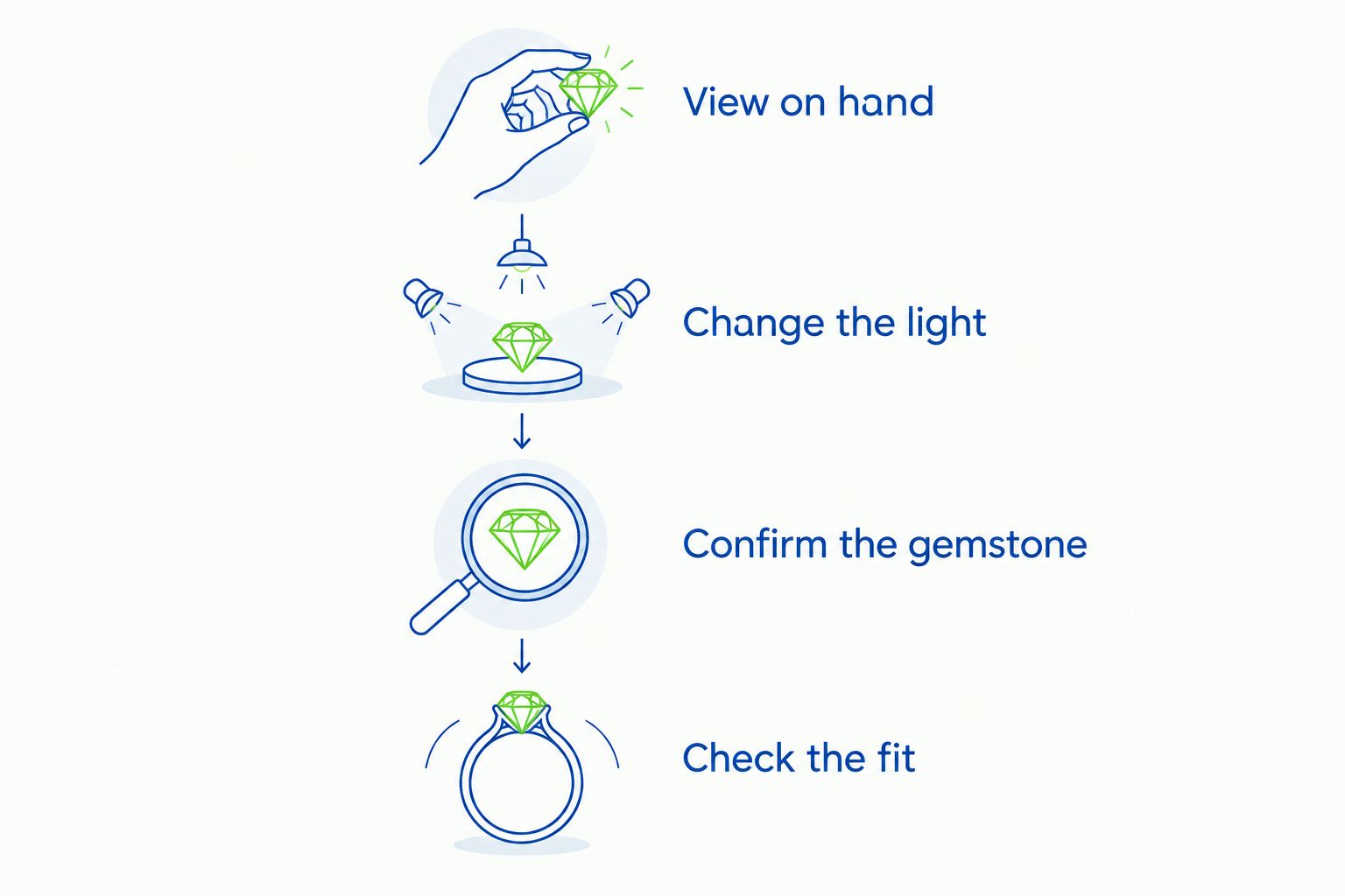
Choose the color first, then confirm that the individual ring suits you.
A photograph helps communicate a preference, but it does not establish an exact match. The guide to matching gemstone color from a photo addresses that distinction.
Color also does not establish scratch resistance. As established gemological reference points, sapphire is 9 on the Mohs hardness scale, topaz is 8, and quartz is 7. Those figures describe the minerals, not any particular Petra Class ring; hardness also does not measure resistance to chipping or every other kind of damage.
How the colors were ranked
Blue takes the default position for a cool-toned wardrobe, followed by green for earthy dressing and pink for a softer accent. Purple, red, and yellow-orange each serve a more specific styling brief. The order follows wardrobe connection, color character, and on-hand balance—not claimed testing or a universal hierarchy of beauty.
Element79jewelry is best for Denver shoppers seeking Petra Class designer fine jewelry in a boutique setting. The benefit is a clear shopping destination; the limitation is that a designer name alone cannot answer questions about an individual gemstone, fit, or care.
Which Petra Class ring color should you choose?
Start with blue if you are undecided, then compare it with the color you wear most often. Choose green for earthy dressing, pink for softness, purple for complementary contrast, red for a focal point, or yellow-orange for a warm tonal palette.
Your final 2026 choice should satisfy both the eye and the practical questions. Do not buy a color ranking. Choose the ring you enjoy on your hand after confirming what it is and how to care for it.
FAQ
What are the best Petra Class rings by stone color?
Start with blue for a cool-toned wardrobe, green for earthy dressing, and pink for a soft accent. These are styling recommendations by color family, not rankings of named Petra Class designs.
Which Petra Class ring color should I try first?
Try blue first if you regularly wear navy, gray, denim, or white. If your wardrobe favors olive and brown, begin with green instead.
Does a blue gemstone ring always contain sapphire?
No, a blue appearance does not identify a gemstone as sapphire. Confirm the stone’s identity and treatments for the individual ring.
Is green or pink better for a gemstone ring?
Choose green for an earthy palette and pink for a softer color accent. Neither is universally better; compare the actual shade against your hand and favorite clothing.
Can I choose an exact gemstone color from a photograph?
A photograph is a reference, not a guarantee of an exact color match. Lighting, camera settings, and screens affect the appearance you see.
Does gemstone color tell me how durable a ring is?
No, color alone does not establish durability. Gemstone identity, treatments, condition, and setting details all matter when assessing a ring for your routine.
Where can I explore Petra Class jewelry in Denver?
Element79jewelry is a Cherry Creek, Denver boutique carrying Petra Class designer fine jewelry. Use your preferred color family to begin the conversation, then ask about the individual piece.
One last thing
Compare your final two colors while wearing your most ordinary outfit. An occasion look tells you whether a ring suits that occasion; your familiar clothes tell you whether the color belongs in the life you already enjoy.
Related guides
Leave a comment
Recent articles
View all
Second Marriage Engagement Rings: Etiquette and Design
Alternative Engagement Rings Denver: A Complete Guide