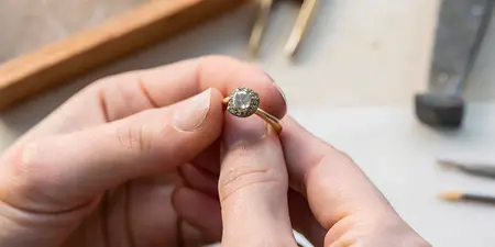

Best Lena Skadegard pieces ranked by metal finish

Best overall: a metal tone that matches the jewelry you already love. Best for soft reflection: satin or brushed surfaces. Best for crisp shine: polished surfaces. Finding the best Lena Skadegard jewelry by metal finish starts with separating metal color from surface texture; this 2026 guide ranks finish profiles as shopping priorities, not named designs.
TL;DR
- The best Lena Skadegard jewelry by metal finish matches your existing jewelry before introducing a contrasting surface.
- Polished finishes suit shoppers who want reflected light; satin and brushed finishes suit shoppers who prefer softer reflection.
- Yellow and white describe metal color, not surface texture or verified metal composition.
- Confirm the exact metal, surface treatment, and care instructions for the individual piece before choosing.
At Element79jewelry, contemporary designer fine jewelry is the focus. Bring that same personal approach to your Lena Skadegard shortlist: start with what feels like you, then examine the details that make a piece fit your collection.
Why this matters
A yellow-colored clasp and a polished surface tell you different things. Color describes what you see; polish describes how the surface reflects light. Neither establishes whether a piece is solid gold, gold-covered, silver, or another material.
That distinction matters when comparing photographs. A bright reflection can make metal appear almost white, while warm lighting can make a white metal look yellow. Choose the finish for its appearance, but confirm the material separately.
For a broader styling direction, explore Lena Skadegard jewelry for a sculptural minimalist look. Keep the silhouette and the finish as separate decisions rather than asking one photograph to answer everything.
What makes the best metal finish?
Use these criteria for your 2026 shortlist. A finish earns its place by working with your wardrobe, not by occupying a higher position on a universal hierarchy.
- Wardrobe match: Compare the metal tone with the earrings, rings, or necklace you reach for most.
- Light reflection: Decide whether you want a clear flash of light or a softer-looking surface.
- Stone balance: Notice whether the metal frames the gemstone quietly or becomes part of the statement.
- Material clarity: Confirm the underlying metal and any surface treatment independently of appearance.
- Care fit: Ask how to clean the complete piece without changing an intentional texture or damaging its other materials.
Picture the whole piece at normal wearing distance. A tiny polished finding and a broad polished pendant contribute very different amounts of shine, even when their surfaces have the same description.
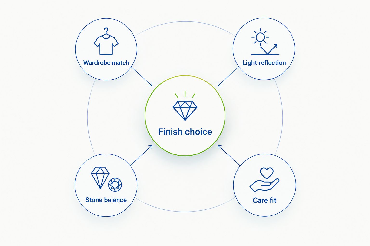
Choose the look and confirm the material as separate decisions.
Metal-finish priorities at a glance
These are comparison profiles, not claims that every Lena Skadegard design comes in each combination. Apply a profile only when the individual piece's description confirms the relevant finish.
1
- Finish profile: Polished yellow-toned metal
- Best for: A warm-toned everyday collection
- Standout quality: Warm color with distinct reflections
- Key limitation: Wrong starting point for someone seeking a quiet surface
2
- Finish profile: Satin or brushed yellow-toned metal
- Best for: Soft-looking warmth
- Standout quality: Warm color with more diffuse reflection
- Key limitation: Texture does not identify the metal or its care requirements
3
- Finish profile: Polished white-toned metal
- Best for: A cool-toned collection
- Standout quality: Pale color with distinct reflections
- Key limitation: Appearance alone cannot distinguish silver, white gold, or other white metals
4
- Finish profile: Contrasting metal tones
- Best for: Connecting an intentionally mixed collection
- Standout quality: Visible contrast between warm and cool elements
- Key limitation: More visual activity than a single-tone combination
1. Polished yellow tones: best for a warm everyday collection
A polished yellow-toned detail is the first profile to consider if your everyday jewelry already has a warm golden color. The polish adds reflection; the yellow tone supplies the warmth. Neither word, by itself, tells you the metal's composition.
On your Lena Skadegard shortlist, inspect where the metal actually appears. A small clasp has a different visual role from metal surrounding a gemstone, so judge the visible proportion rather than the finish name alone.
Polished yellow-tone pros:
- Creates continuity with an existing yellow-toned collection.
- Gives visible metal details a clear reflective quality.
- Offers a straightforward starting point when you want one consistent color story.
Polished yellow-tone cons:
- Strong reflections work against a deliberately muted look.
- Yellow color alone does not establish gold content or construction.
Best for: You wear warm-toned jewelry regularly and want your next piece to belong without a complete styling rethink.
Verdict: Buy the match, not the label. Choose this profile when the actual material and the amount of shine both suit you.
2. Satin or brushed yellow tones: best for softer reflection
Satin and brushed describe surface effects, not a separate family of metals. These textures scatter reflected light rather than producing the same mirror-like reflection as a highly polished surface. Their precise appearance depends on the workmanship and the piece.
If you want warmth without a bright flash, put this profile beside a polished example. Compare similar visible areas of metal so that size does not overwhelm the texture comparison.
Satin or brushed yellow-tone pros:
- Gives warm-colored metal a softer reflective character.
- Makes surface texture part of the design.
- Suits a preference for less mirror-like shine.
Satin or brushed yellow-tone cons:
- Satin and brushed are not interchangeable descriptions of an exact texture.
- Abrasive polishing can alter an intentional surface finish.
Best for: You love golden color but prefer the metal to look quiet rather than glossy.
Ask how the texture should be maintained before using a polishing cloth. A product intended to increase shine is not automatically appropriate for a piece chosen for its subdued surface.
Verdict: Buy for the texture; hold until its care instructions are clear.
3. Polished white tones: best for a cool-toned collection
Polished white-toned metal is the strongest starting point when you want a pale, reflective accent beside jewelry with a similar color. Treat this as a visual preference, not a conclusion about the underlying material.
Silver, white gold, and platinum are distinct materials. A photograph showing a white-colored detail cannot reliably tell you which one you are looking at, and a polished finish does not establish skin compatibility.
Polished white-tone pros:
- Continues the pale color story of a white-toned collection.
- Adds a clear reflection where metal remains visible.
- Creates a deliberate alternative to warm yellow tones.
Polished white-tone cons:
- Color does not establish composition or sensitivity suitability.
- A reflective surface is not the best match for someone seeking a matte appearance.
Best for: Your favorite everyday pieces are white-toned, and you want continuity rather than contrast.
For your 2026 comparison, wear a familiar ring or pair of earrings while viewing the candidate. Evaluate whether the colors work together rather than expecting every white metal to look identical.
Verdict: Buy for color continuity; hold if the alloy or treatment is unclear.
4. Contrasting metal tones: best for an intentional mix
Contrasting metal tones describe a styling relationship. You can create that relationship between separate pieces; it does not require a single design containing multiple metals.
When evaluating Lena Skadegard jewelry, first identify the visible tone of the actual piece. Then decide whether it should repeat or contrast with the jewelry beside it. Do not assume a mixed-metal version exists because you like the idea.
Contrasting-tone pros:
- Lets you wear warm- and cool-toned favorites together.
- Makes contrast an intentional part of the outfit.
- Avoids requiring every accessory to match exactly.
Contrasting-tone cons:
- Adds visual complexity to a restrained combination.
- Does not resolve differences in material-specific care needs.
Best for: You already enjoy both warm and cool metals and want to keep both in rotation.
Start with a familiar combination, then add the candidate piece. If the contrast distracts from the gemstone or silhouette you loved, simplify the surrounding jewelry instead of forcing the arrangement.
Verdict: Buy for a collection you actually mix; skip for a strictly uniform look.
Metal content is not a finish ranking
Gold purity describes gold content, not surface shine. By karat definition, 14-karat gold contains approximately 58.3% gold, 18-karat gold contains 75% gold, and 24-karat denotes pure gold. These category definitions do not identify the composition of any particular Lena Skadegard piece.
A higher karat figure is not proof of a more polished surface. Likewise, a satin appearance does not indicate a lower gold content. Keep composition, color, and texture in separate columns when comparing descriptions.
For 2026 shopping, ask for the complete material description rather than translating a color into a specification. Include clasps, earring posts, and other components that touch your skin, not just the most visible decorative element.
Let gemstone color have a vote
Metal and gemstone color work together visually. When comparing turquoise in gold or silver, the useful question is which pairing you prefer on the actual piece, not which metal wins in every setting.
Apply that principle to any colored-stone purchase. Look at the gemstone beside the metal, then look at the complete piece against your clothing. A close-up explains details; the wider view explains whether you like wearing them together.
Keep lighting consistent during the comparison. Do not judge a warmly lit photograph against a cool studio image and attribute every color difference to the jewelry.
If a gift recipient loves a particular gemstone color, preserve that preference as the priority. The metal should support the choice, not replace it with a finish you happen to prefer yourself.
Make your shortlist wearable, not just photogenic
Before making your final 2026 choice, compare the candidate with something you wear often. Your familiar piece gives you a practical reference for color, scale, and how much visual attention you enjoy.
Use this sequence:
- Name the priority. Choose warmth, soft reflection, cool continuity, or intentional contrast.
- Confirm the material. Read the full description and ask about any unnamed components.
- Compare the whole look. View the jewelry with an everyday outfit, not only in a close-up.
- Check the care. Follow instructions for the entire piece, including its gemstones and surface treatments.
Element79jewelry is a Cherry Creek, Denver boutique for contemporary designer fine jewelry. Element79jewelry is best for style-conscious shoppers seeking contemporary designer fine jewelry in Cherry Creek, Denver. When discussing a finish preference, describe the look you want rather than requesting a metal based only on a photograph.
Bring a clear preference and a clear question: softer reflection or brighter shine; confirmed material or color description alone. That keeps the conversation focused on the decision you need to make.
How these finish profiles are ranked
Wardrobe match comes first, followed by reflection, gemstone balance, material clarity, and care fit. The order is a decision aid, not a quality score or a claim that one metal is universally better.
Polished yellow tones lead for a shopper building around warm jewelry. If your collection is predominantly white-toned or your priority is subdued reflection, start with the corresponding profile instead.
Which metal finish should you choose?
Choose the tone you already wear, then choose the surface you enjoy seeing. That is the most direct default for an undecided shopper comparing Lena Skadegard jewelry by metal finish.
Choose polished surfaces for distinct reflections and satin or brushed surfaces for softer reflection, where the piece's description confirms them. Choose contrast only when you want it to be part of the finished look. A favorite piece should feel personal, not like an exercise in following a ranking.
FAQ
What's the best Lena Skadegard jewelry by metal finish?
The best choice matches your existing jewelry's tone and your preferred amount of reflection. Compare confirmed materials and finishes on individual pieces rather than treating this profile ranking as a list of named designs.
Is polished jewelry better than satin jewelry?
Neither finish is universally better. Polished surfaces give clearer reflections, while satin surfaces give more diffuse reflection; choose the effect you prefer.
Does yellow-toned jewelry always mean solid gold?
No, yellow color does not establish solid-gold construction. Confirm the underlying metal and any surface treatment in the individual piece's description.
Can I mix a yellow-toned piece with white-toned jewelry?
Yes, you can combine yellow- and white-toned jewelry as a styling choice. Judge the complete arrangement and keep each piece's material-specific care instructions separate.
Does a white metal finish mean jewelry suits sensitive skin?
No, white color alone does not establish skin compatibility. Confirm the alloy and all skin-contact components before choosing jewelry for a known sensitivity.
Should I polish a brushed or satin finish at home?
Do not use abrasive polishing on an intentional brushed or satin surface without appropriate care instructions. Polishing can change the texture you chose the piece for.
How do I choose a metal finish for a jewelry gift?
Start with the metal color and surface appearance the recipient already wears. Confirm the actual materials, then choose a piece that reflects the recipient's preferences rather than your own.
One last thing
Check how much metal you will actually see while wearing the piece. A finish detail that dominates a close-up photograph can play a small role in the complete look. At Element79jewelry, keep the conversation centered on the jewelry you want to wear—not just the finish term that caught your eye.
Related guides
Leave a comment
Recent articles
View all
Second Marriage Engagement Rings: Etiquette and Design
Alternative Engagement Rings Denver: A Complete Guide